
|
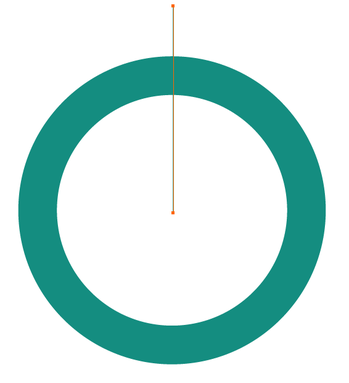
I had posted here a method to create a pie chart with accurate percentages, but this is a way to add a bit more interest within the chart. In this one, I made it look like the pie chart indication looks like a tube inside the chart instead of having separate wedges, they are unified by a single color that borders the lighter color. 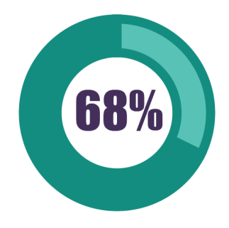 Start with a drawing a circle. Hold SHIFT to create a perfect circle. Keep the fill off, add a stroke and set the point size (in this case it's 40 pt stroke) 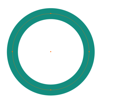 Outline the Path to convert the path to a shape. Object > Path > Outline Stroke. 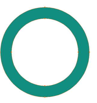 Draw a line from the center of the circle, hold the SHIFT down to create a vertical line. Draw the line beyond the outside edge and add a 1pt stroke to the line. Color of the stroke is not important as the line will go away... in a few steps.
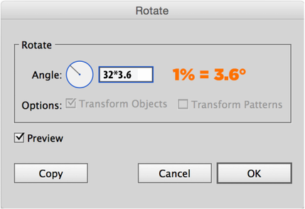
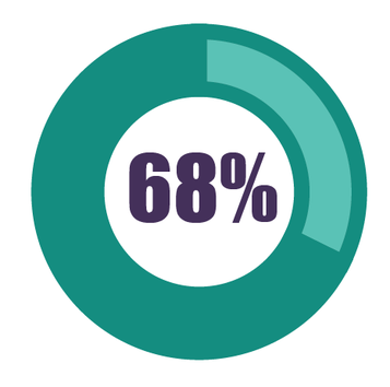
Select the vertical line, then select the Rotate Tool (R) and bring the cursor to the center of the circle, hold OPTION and click in the exact center of the circle. OPTION brings up the Rotate Dialog box, click relocates the reference point at which the rotate command will rotate around. With the rotate dialog box, you can convert a PERCENTAGE to degrees in a circle. 1% = 3.6° of rotation. Instead of using a calculator, you can do the calculations IN the field as shown below. In this case, I am using 32% and multiplying it by 3.6 DON'T CLICK OK, you want to click copy instead. The calculation in the field will then rotate the line but you want to COPY the line to keep the original vertical line and get the second line rotated to the new angle that is calculated. 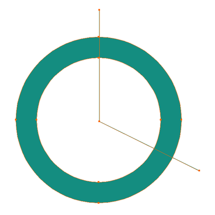 Select both lines and the circle. Using the Divide the action in the Pathfinder Panel, this will divide the circle at the line intersections. Then Ungroup the resulting shape (Object > Ungroup) 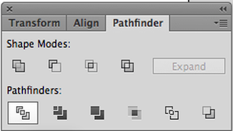 Select one section of the newly divided circle and change the color. The other section choose a lighter or darker color. Pick something that will offer decent contrast. 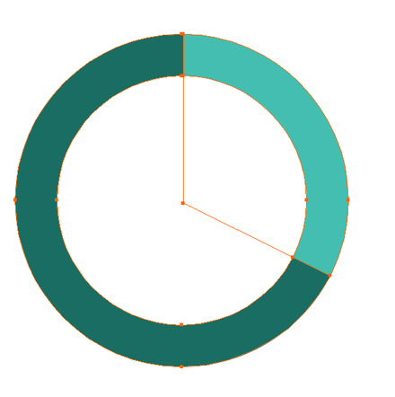 Then add a 12 pt stroke to both of the shapes using the same color as one of the segments. In this case I chose the darker green. 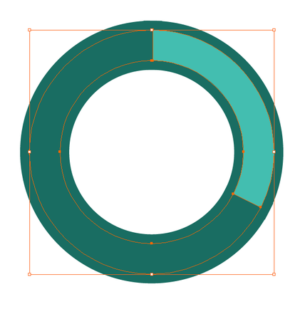 Using the Stroke Panel, set the stroke to the Outside so the stroke does not invade the segment and make it appear smaller. 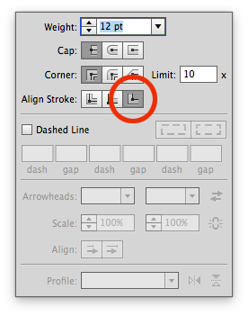 The final result with darker and lighter colors as outlines to show emphasis on either shape.
0 Comments
Leave a Reply. |
Archives
March 2021
|

 RSS Feed